- Tips & Tricks
- Jul 02, 2021
How product image optimization techniques can drive more sales and traffic to any e-commerce store?
Why Product image optimization is important?
As content becomes universal, more users prefer visuals that have the ability to communicate effectively. Besides, visuals are much easier to process when compared to text.
Technological advancements have completely changed the way people consume content. This holds for modern consumers, considering the shopping behavior.
Gone are the days when buyers only focused on the text before making a purchase. These days, a product is all about clear, attractive, and catchy images.
For eCommerce platforms, visuals are an integral part of sales and marketing. With this post, we will dig deeper into the power of product and background images, and how they drive ecommerce traffic growth.
Without any further ado, let’s get started!
Why do eCommerce Platforms Require Good Images?
We have often heard that an image is worth a thousand words. The statement stands true for online sales. When shopping online, no images or poor quality images means a no-go for most potential buyers.
But why do visuals matter? Because images help you scan much faster. In fact, good photos can make the buyers stick around for reading the accompanying text description as well.
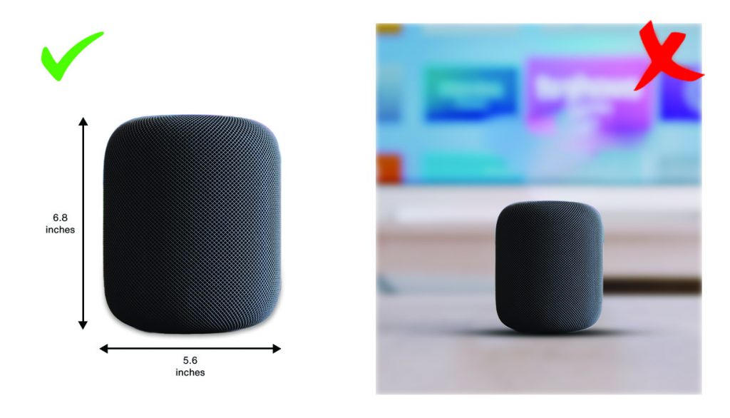
Besides, offering good-quality images also reduces the chance of returns. It’s no shock that the majority of the products are returned for not meeting expectations. However, that won’t be a problem anymore if product photography is done correctly.
Ultimately, product images provide a more personalized and trustworthy experience to the buyers, especially when paired with the right background.
Tricks to Drive Traffic and Sales with Product Images
Most online shoppers tend to judge a brand’s trustworthiness and the product’s value on the basis of visuals. So, it is no surprise that eCommerce website owners need to prioritize image quality.
Let’s take a look at the top ways to make your images stand out.
Light the Images Right

Buyers are looking to build trust through pictures and picture backgrounds. And providing dim and blur photos will only seem manipulative.
Good quality visuals are a great way to win consumer trust. The first way to do the same is to add proper lighting to the product. The good news is that you don’t have to spend money on lighting; use natural light.
Best product images are clear and clicked in a good lighting condition. In case you are new to photography, try to avoid using flash as it can get technical.
Opt For a Clear Backdrop
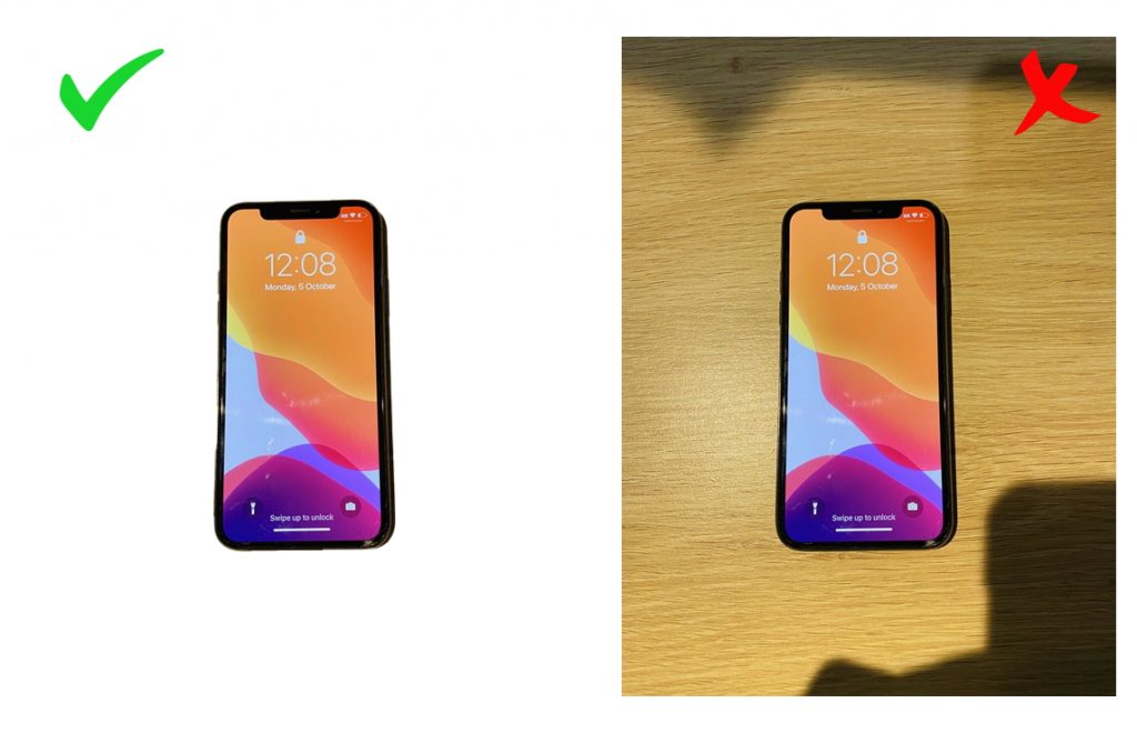
A clear backdrop works for all types of images. Besides, choosing a clear or white background makes it much easier for eCommerce businesses to stay within guidelines.
To create your own white background, you can use a free background remover tool like Slazzer. It removes image background automatically in seconds with just 1 click.
Show Multiple Use Cases
When it comes to online shopping, customers make decisions based on two types of information –

- The information available on the internet (text, images, and videos on the website as well as reviews)
- Suggestions from family and friends
Therefore, optimizing your visual content is the key to affect potential customers’ purchasing decisions. But how do you persuade your customers?
One of the most clever tactics is to inform the customer about the use case of the product. This trick is handy when the product is multi-functional. For instance, when selling a cardigan, use several images that inform customers about wearing the cardigan in different ways.
Use Pictures of a Person Using the Product
You must be wondering why this is important! However, think of a business selling chairs and posting pictures of the chair alone. Even worse, imagine seeing pictures of gorgeous dresses but no one actually is wearing it to show how it fits and flows on the human body.
In such cases, adding lifestyle shots with human models can –
- Create a sense of connection between the buyer and product
- Allow the buyers to make a more informed decision ‘
- Let the buyers analyze product size and its usage
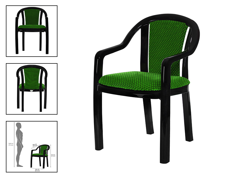
Provide a 360° View of the Product Image
One of the major problems users experience while shopping online is the lack of physical touch with the products. Hence, the more convincing your product images are, the higher the chances of closing a sale.
When we talk about compelling images, what’s better than a 360° view of the product? This tactic is native to the luxury industry like watches and jewelry, where users get to see product images from every angle.
One of the brands to look up to is Brilliant Earth. The brand allows its users to interact directly with product images and move them to view the whole design.

Opt For Minimalism
Have you noticed that the biggest names in the industry use white or transparent backgrounds for their images?
No, it’s not just meant for consistency! Having a white background allows the user to focus on the product images and avoids being distracted by unnecessary details.
Amazon and Sephora are very consistent with their product images, using white backgrounds for most products. Believe us, a white background can enhance a brand’s image while appearing consistent in users’ eyes.

Takeaway
If you are new to the eCommerce industry, you may tend to think that a product should only be –
- Clear
- Crisp
- Captivating
However, with the digital world evolving, the benchmark is high, and users expect much more. Selling a product online is not just limited to high-quality, well-captured pictures but also requires effort into product presentation.
Using images with text makes the content less boring and allows users to scan through quickly. Shoot your pictures in the best lighting, add human touch, and be consistent by removing background or using a transparent background to avoid distraction. Capture user attention with premium-quality visuals and drive traffic to your online store!


Comments (0)