- Tips & Tricks
- Jun 03, 2021
White Background a must for any e-commerce store

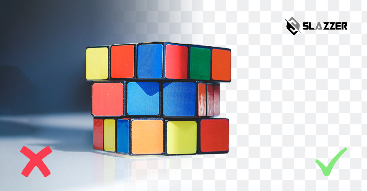
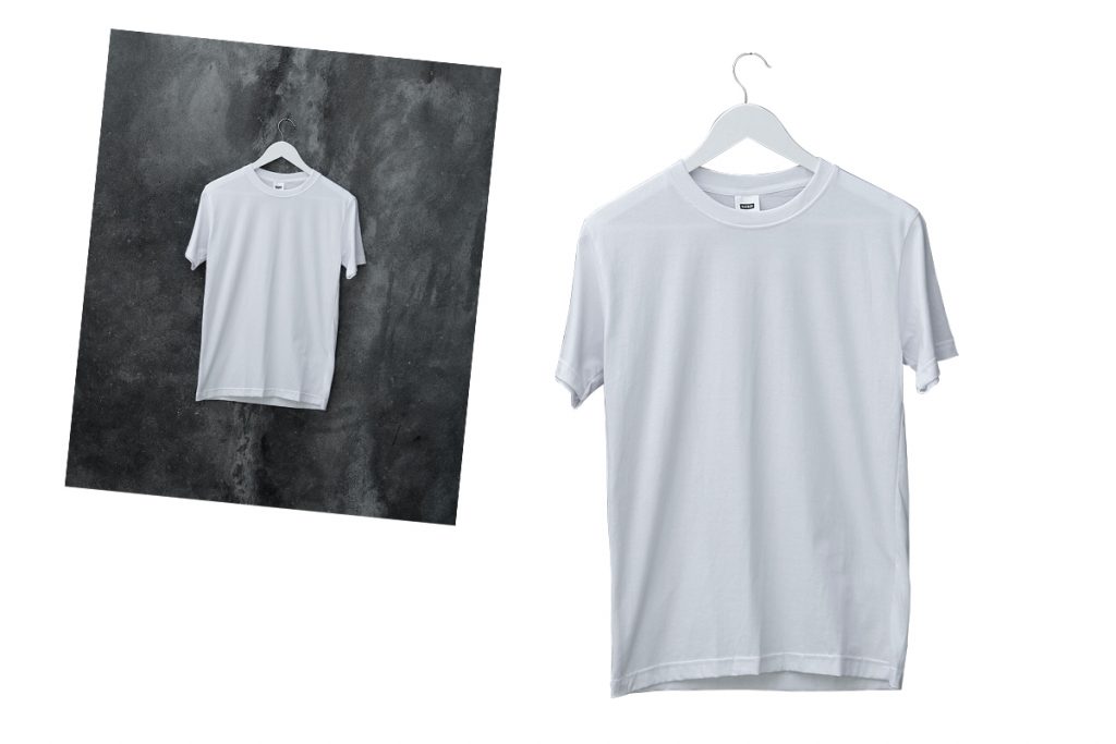
These days, it seems like everyone is using a white and transparent background for product images! Gone are the dark and dingy background patterns that have been an integral part of the design process for a while.
Needless to say, product images are the first point of contact between the buyer and seller. Customers often form a brand image on the basis of the product photos available on the website. It is the styling and visualization of images that eventually builds trustworthiness and determines product value.
For this reason, eCommerce businesses are keen on improving the image as well as background quality. Now the question is, why should you choose a white or transparent background instead of vibrant, attractive patterns and dark shades?
As per some statistics, 76% of seven million images have a plain white background. That’s huge! The elementary reason to prefer white backgrounds is that it’s classic, timeless, uncluttered, and clean.

It forms an image of elegance by making the products seem clean and sophisticated. On the technical side, white background makes the images on a product page look consistent. Moreover, the buyers can focus on the actual product rather than being distracted by unnecessary details.
Experts are of the view that images with clear backgrounds can increase traffic and drive sales. So wouldn’t you want to know the top reasons for choosing a white background? Read on as we reveal them!
Top Reasons To Choose a White Background
Highlights the Product
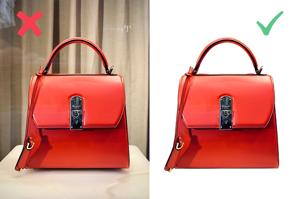
Images are the key to online selling. Sellers must minimize visual elements in product images other than the product itself. Choosing a white background will avoid distraction and allow the buyers to focus on the product.

Basically, with a white background, you are diverting all the attention and focus to the product. Since the product details become more prominent, it is more realistic to look at.
Not having a background can present the product photo accurately with minimum distractions. As the product becomes the focal point of the entire image, customers feel more connected to it.
Promotes Consistency
“If you want to be taken seriously, be consistent.” Considering white background photography for the images on your product page can promote consistency.
And consistency makes the customers feel that a brand is professional and trustworthy. Besides, product images look more organized with background removal or white background and allow the customers to browse through them easily.
Cost-Effective
Editing product images can be labor-intensive and expensive. It would cost you a lot to edit thousands of images for your website or eCommerce store. Although there is always an option to hire an in-house editor, it may be an impractical decision as product photos are only edited once and do not require any changes or modifications once uploaded.
On the other hand, you can opt for a photo editing company or a platform that helps with background removal. Such platforms are a cheaper alternative and can remove thousands of image backgrounds in a click.
Optimizes and Minimizes the File Size
Another major benefit of having a white background is that it reduces the file size, making it easier to upload. Smaller file sizes can increase the website’s loading speed, apart from meeting the upload standards.
No doubt, a longer page load time can annoy the customers, and they may exit the website without making any purchase. It can also lead to decreased search ranking and consequent lost sales.
Makes the Product Look Clean
While you may think that customers prefer extravagance and complex product images, it is not true. In fact, potential buyers get dissuaded from purchasing when the product image is too distracting.

Sometimes, beauty lies in minimalism and simplicity. Let the product speak for itself without going over the board with a background.
When Should you Avoid Using a White Background?
A white or transparent background may be the best option for most products. Big names such as Amazon often use a white background for their product images to maintain consistency and highlight the product.
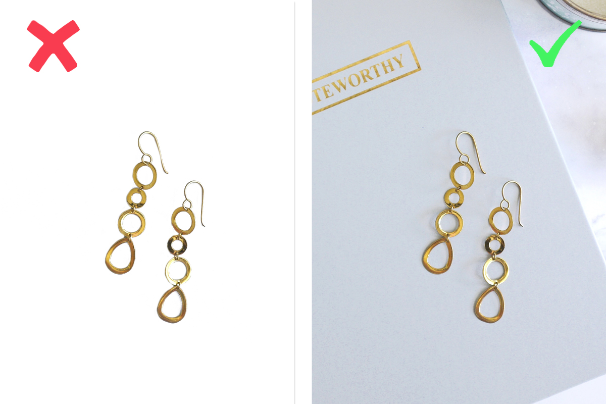
However, there are times when a plain white background may not be your best deal! First things first, a plain background can sometimes make a product appear dull and boring.

This stands true for products that require a thematic or colored background. For instance, jewelry can look dull when presented on a plain background. It needs some special effects such as shadows, backdrop, or other props to catch user attention.
Additionally, white backgrounds are the best for posting product images in online marketplaces. However, lifestyle shoots are more appropriate for social media platforms, where users prefer interesting and attractive pictures.
Tips For Using a White Background
Now that you are acquainted with the reasons to use a white background, here are a few tips for doing it effectively.
Create Contrast
Opt for bright and dark colors that will communicate with the users against the white background. Most people prefer black for typing on a white background because it is easy to read and see. The same applies to images.
Use pictures that aren’t overly white in focus. You can also add a black border around the image to set it apart from the plain background.
Space it Right
The best way to bring out the beauty of a transparent background is to give plenty of space to every element in the image. Consider adding extra space around the object and leave wider margins between menu items and text.
Final Thoughts
If you plan to create product images that sell, place your bet on being consistent by using a white background. A transparent or white background is especially helpful when posting on established marketplaces such as Amazon. A white background will –
- Help create consistency
- Allow the users to focus on the product image
- Avoid distractions
- Help save cost
- Make the product look clean
While plain white and transparent backgrounds aren’t new, now is the time to use them to drive traffic to your products. Go ahead, use background removal platforms for free, and ramp up your sales.


hello
hello