- Tips & Tricks
- Sep 24, 2021
Why is it important to color grade your image?
Often we see a video or image on social media that piques our interest, and when we try to create something similar, it doesn’t come out well. This is where Color Grading comes in. The question then becomes, what is color grading?

Color grading is an inexpensive way to enhance the visual appearance of photos and moving images like videos, so they appear more uniform and aesthetically pleasing to the viewers. The whole process involved is divided into two parts.
- Color Correction: It is the process of adjusting the colors with tools like white balance, temperature, exposure, and contrast.
- Color Grading: Color Grading is a more creative and less technical process. It adds an atmosphere and emotions to a shot.
The secret of color grading in photography
Almost everyone has used Instagram filters to set a definite tone in the image, that’s color grading at a micro level, a photographer, on the other hand, uses more advanced color grading software like Adobe Photoshop or Adobe Lightroom.
Here are a few tricks that will help in color grading the background of an image perfectly.
1) Color Psychology
Understanding the true meaning of colors is very central for a photographer. For instance, red can be associated with love and passion and can also show danger and aggression, blue color represents harmony, loyalty, and compassion and is one of the most popular colors used while color grading, lastly yellow represents both good and evil, optimism and jealousy. These three are the primary colors.
Green represents nature, freshness, and growth but also conveys jealousy and envy, orange color is associated with joy and youthfulness, purple has a calming effect and is used to show mystery, fantasy, and all things unattainable. These are the secondary color.
These color palettes can be divided into warm and cold palettes, and the saturation and intensity affect the emotional perception of an image. So next time you are color grading your image keep these palettes in mind to create the right impact on your picture.

2) Color Harmony
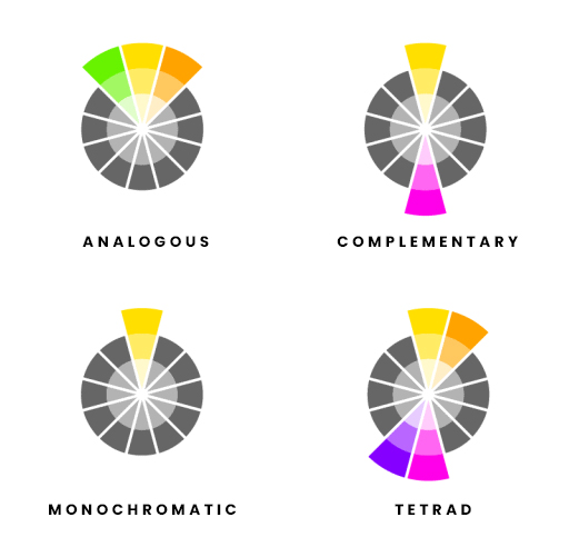
Color Harmony is a combination of colors that make the background of an image stand out. We come across hundreds of images daily, out of which only a few catch our attention because of their impeccably selected colors. Color Harmony is of four kinds –
- Monochromatic, in which shade, tint, and tone of a single color is used in an image;
- Analogous color, in which selection of a group of colors that are similar and blend well together
- Complementary colors are colors when combined with high-contrast images.
- Triadic color involves using three different colors in which one is a key color, and the other two are distributed evenly.
3) Color Management
It is a process that controls how different colors look on different media. Colors need to be consistent so that the background in the images looks just like the way they were captured.
How color grading describes a photograph’s first impression?
Color grading enhances an image by manipulating colors to create a new tone. According to Studiobinder.com, “Color can affect us emotionally, psychologically and even physically, often without us becoming aware.” If the image is color graded properly, it will evoke feelings in the mind of the audience at the first glance. Even simple editing would make a photo complete and cohesive.
The mood of a scene: Color grading
Color Grading theory in photography is a significant element in the post-production process. Color has the power to affect our feelings and mood. It can set a time of day for any image, making a day shot to look like a night shot and vice versa. You can add blue hues to give your image a colder look or make it warm by adding yellow hues. By using and experimenting with different color palettes, a photographer can utilize the power of color psychology to make their image more influential and effective. Colors evoke emotions and go beyond action taking place in a photo. It can make an image appear sharper than the original.
Cinematic color grading
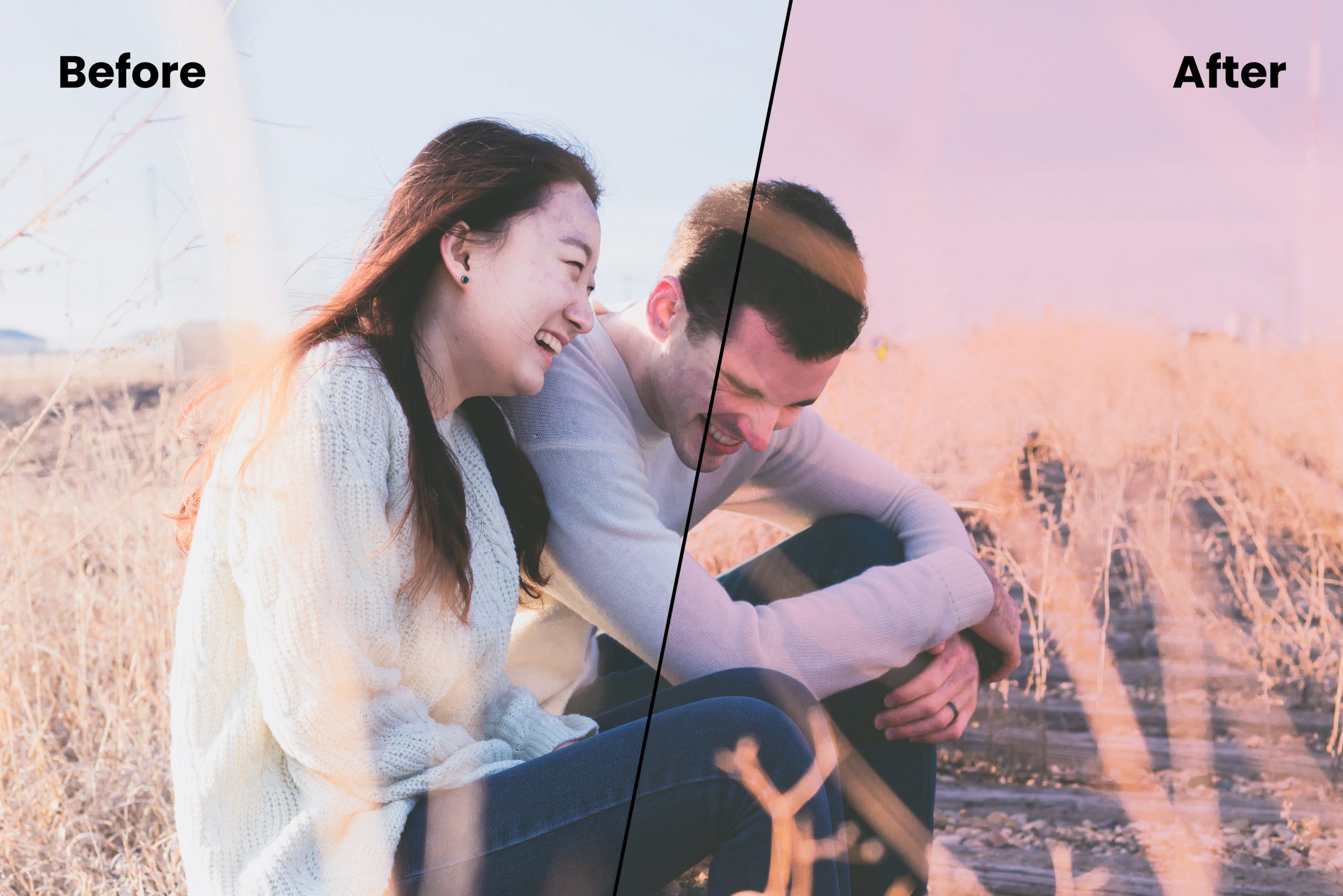
Filmmakers use color grading for cinematic purposes. Color grading is a subjective art form, and it has the potential to make any image or video pleasing, calming, disturbing, unsettling, or boring. The use of color grading in cinemas makes us absorb and accept the art form as reality. For example, to make a horror movie more spooky, a dimmed video and a higher contrast level can be employed to achieve the effect. Similarly, for a romantic photo or video, a higher saturation level will add a warmer tone.
Color grade your footage
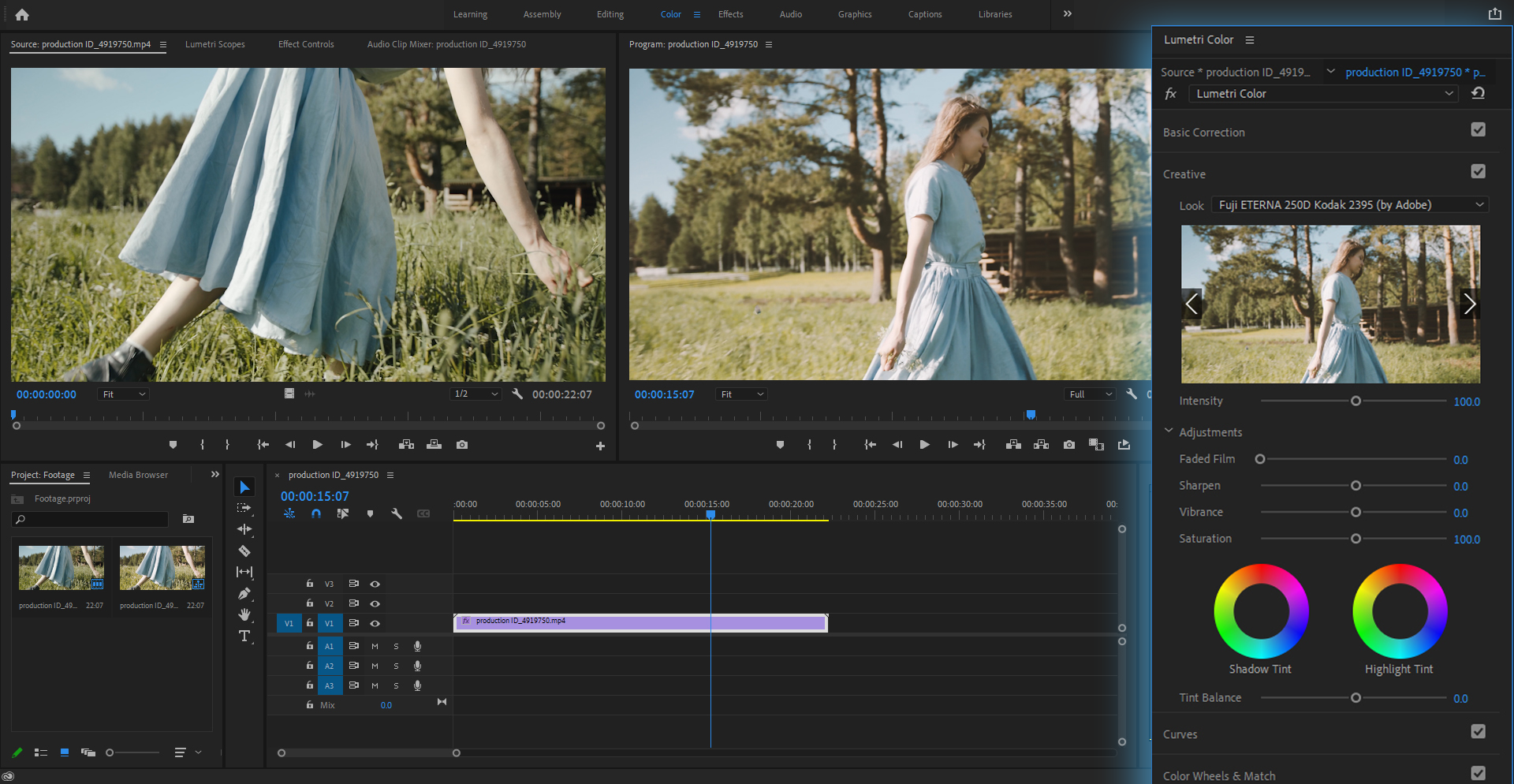
Different editors have different styles of processing an image or video. The workflow, however, is the same everywhere.
The first step that every editor takes is fixing the contrast, saturation, and temperature of footage.
The second step is to color correct the footage. The image needs to be color corrected before color grading or, it can pose a challenge for the editor. You can read more about color correction in our other article.
In the last step, you can grade your footage manually, or with a LUT after the color correction has been completed. Manual editing gives full control to the editor. Using a creative LUT can save time and add consistency. After these and few minor adjustments, the footage is ready to be viewed.
The background of an image plays a crucial role as it’s where most of the adjustments are required. If it is not proper, it can be edited by background removal tools like Slazzer, which will make the image transparent so that you can add any backdrop of your choice.
Creating LUTs
A LUT is a look-up-table, is a math-based direction to replace a color (based on RGB) with another one. Although this process is not widely used, it continues to exist. This process is done pixel by pixel with very high accuracy. Video editors use two kinds of LUTs.
Technical or Normalization LUTs – A camera collects digital format and transfers it into a viewable format. Sometimes the images can be flat or in a log profile. By reducing the contrast level when using log color profiles, the camera is able to capture more information in an image. A normalized LUT transfers the log image into another color space and brings back contrast and saturation lost while recording.
Creative LUTs – These LUTs apply adjustments to different colors to create a certain mood or tone in the image. It is a kind of preset that photographers can directly apply to their photos without going through the tedious process of manual editing.
A photographer has to keep many elements in mind while clicking an image. He needs to create high-quality content that is engaging and concise. Color Grading will help the photographer in enhancing the photos. A perfect color-graded picture will resonate emotionally with the audience. It is the final step of the post-production workflow and will be worth investing the time.


Comments (0)